|
||||||||||||
|
||||||||||||
|
Tuesday, September 8, 2015
Painting Classes at UC Berkeley Extension


Friday, February 6, 2015
Surface Tension | BLUE

 |
| John Zurier |
 |
| Mark Grotjahn, oil on canvas |
 |
| Mel Prest |
 |
| john Zurier |
 |
| Barnet Newman |
 |
| Jasper Johns |
 |
| Joanne Mattera |
 |
| Jasper Johns |
 |
| Jasper Johns |

 |
| Jasper Johns |
 |
| John Zurier |
 |
| Ellsworth Kelly |
 |
| Barnett Newman |
 |
| John Zurier |
Student Work
 |
| Catherine Kiwala, oil on canvas |
 |
| Catherine Kiwala, middle: oil on Arches oil paper |
 |
| Jill Kneeter, oil on canvas |
 | ||
| Catherine Kiwala, detail |
 |
| Jill Kneeter, oil on canvas |
 |
| sarah Merrill, oil on canvas |
 |
| Sarah Merrill, oil on canvas + studies |
 |
| Erica Mutchie, acrylic on canvas |
 |
| Erica Mutchier, acrylic on canvas |
 |
| Penn Hughes, acrylic on canvas |
 |
| Penn Hughes, acrylic on canvas |
 |
| Margarethe Olsson, acrylic on paper |
 |
| Margarethe Olsson, studies |
 |
| Margareth Olson, acrylic on paper |
 |
| Rennee Rechtschaffner, mixed media |
Wednesday, November 5, 2014
JOHN ZURIER INTERVIEWED BY KQED

The works in Matrix 255 all arise from Zurier’s time painting in Iceland and are embedded with personal experiences, emotions, and recollections. Viewers can sometimes gain access to these elements through contemplation or through the works’ titles, but just as often one would need entry into Zurier’s private thoughts. Though the paintings may appear to be total abstractions, they are grounded quite firmly in the Icelandic landscape and Zurier’s experiences there. The lines, paint drops, and blurs in each of these pieces insinuate some specific phenomenon, location, or impression. I sat down with Zurier to talk about Iceland and how it materializes in his work.
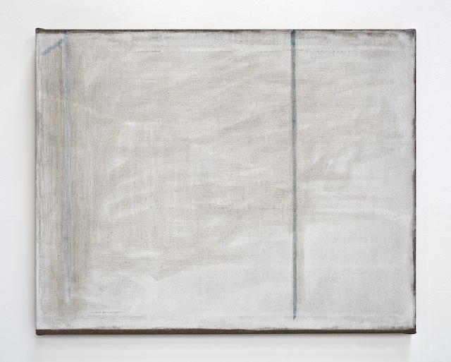
JZ: For me, you experience nature whole. It just comes to you. With the landscape, the things you can’t reproduce are what are interesting to me. You’re dealing with these forces and energies and then try and make a painting that’s an equivalent of that. That’s what I mean about painting in the landscape.
I worked for a couple of years in Iceland making watercolors, but I wasn’t making paintings. It took me a while to figure out how I could make paintings there. One of the things that draws me to Iceland is the light, which is so different for me growing up in California. In California, it’s a really intense Mediterranean light with really strong contrasts. In Iceland, there’s very little contrast in the lights, and some of the things are so subtle. For example, the ocean at twilight will often be lighter than the sky, and there are these subtle color contrasts that happen that are almost at the threshold of visibility. I thought, “How can you paint something like this?”
MHT: Much of your work in Matrix 255 was created in Iceland. What’s your relationship with the country and how did that start?
JZ: My wife Nina and I went to Iceland in 2002 on a horseback trip. We rode through the center of Iceland in the highlands. It was one of the most moving trips of my life. But I didn’t go back until 2011. California College of the Arts asked me to teach a summer class there and I knew I wanted to go back. As soon as I got there, I realized it was perfect. I knew I wanted to be there. We’ve been there for the last four summers, arriving in late May to teach a class for students from CCA, and then Nina and I stay on through July and then go back for Christmas.
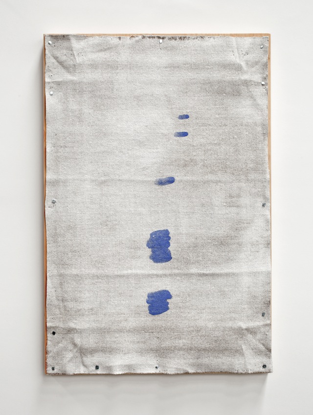
JZ: Some of the watercolors were made in the winter in Reykjavík. And predominantly the works made in Iceland were made during the summer. The winter gets into the work. A lot of the way I work is through memory of things — memory of color, experiences. I come back and start a painting and it’s through the painting of it that I realize, “Oh, I know where this is. I know what this is. This relates to this point here.” So I can’t say what is winter experience versus what is a summer experience. It’s very important to have two experiences, between this extended period of light and then this real short period of light, which is very, very dark.
MHT: Can you tell me a little bit about Héraðsdalur, which many of the paintings are named after.
JZ: That group of work is titled after the farm, where I was living and working this past summer. Héraðsdalur is located in a broad valley in the north of Iceland in a region called Skagafjörður. I met a group of Icelandic artists this summer and they talked about the special light in Skagafjörður. It’s famous for its light.
They told me a story about a nineteenth-century painter from Denmark who came to Skagafjörður because he had heard about the light and wanted to paint this famous light. He got himself a hotel room in the town nearby. Everyday he’d go out, set up his easel, and start a painting. He did this every day for a month and then one day he just packed everything up and went home. He couldn’t capture the light. This is what I was trying to say. The light is the thing that is the most subtle and the most interesting. It’s so special and yet it can’t be captured. How do you put it into form?
MHT: I sense this sort of solitude or unsentimental loneliness in many of these works. Is that something that’s in the landscape too?
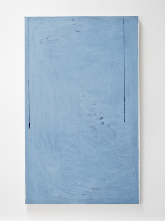
MHT: It seems that names have an important role in your work and could even impact how one feels about a particular painting. For example, I might feel differently about Summer Still (The Same Shadow), which is one of my favorite works in the exhibition, if it was named Across the River or Avalanche, which both seem reasonable for that work. For you, what’s the relationship between a painting and the title you eventually give it?
JZ: It’s often a very specific memory for me. I feel the title can give a different entry into the work. For Duchamp, he thought a title was like adding another color. But the titles have to fit with the energy of the painting. I couldn’t call it Avalanche because it doesn’t have anything to do with it, even though they seem as if they could be random. They’re not random to me at all. Summer Still has to do with the kind of movement and stillness within.
But also, the “Summer Still” was also this idea that it is still summer. It’s a sudden realization that summer isn’t over. It also relates to a poem from an Icelandic poet named Stefán Hörður Grímsson. He has a poem called “Summer Still” and I really wanted to use this title, but I’d used it already for another painting, so that’s why it’s parenthetical. It seemed to me that when you say “Summer Still” and then you call it “The Same Shadow,” somehow those lines get activated.
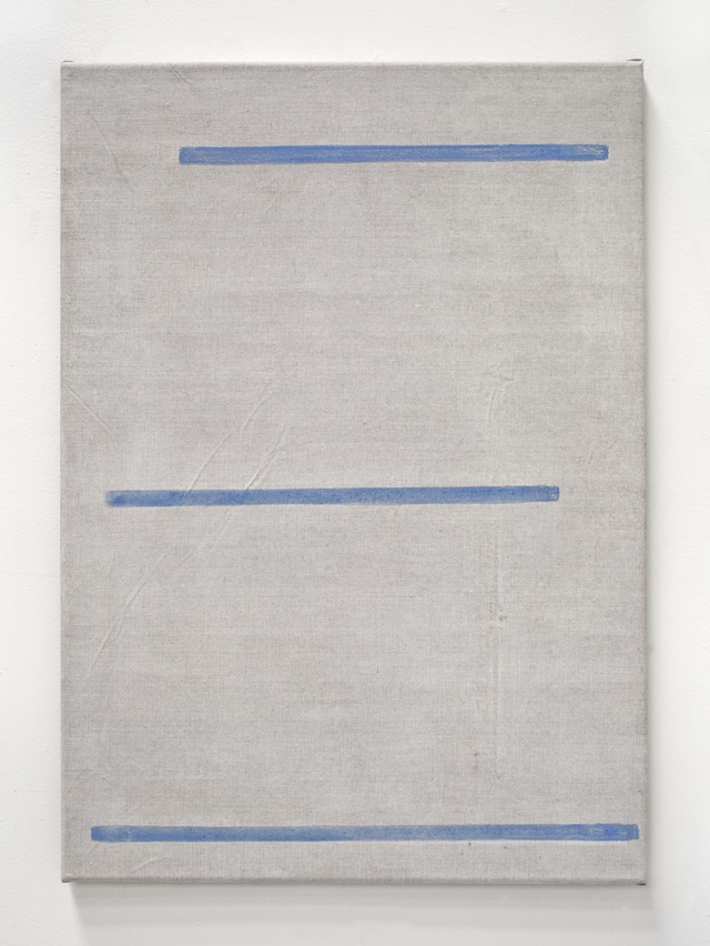
But also there was this feeling of instability. [The lines in the painting] are not perfectly poised formal balances. There’s something a little bit fragile about them. There are avalanche protectors up on the hills and the fjords, especially in a town near where I was staying. It’s a very steep fjord and the towns are right at the bottom; they are prone to being destroyed by avalanches. So they built these structures and they’re in these angles that just go up. It reminded me of that — something that seems so tenuous and fragile but is able to hold some big force.
MHT: Avalanche was another work I wanted to talk about in relationship to this idea of the title being an entry. When I first approached that work, before looking at the title, I didn’t feel what I would associate with the violence of an avalanche. But then after seeing the title I stared at the painting a little longer. Then, as opposed to the instability you felt, I could sense a sort of calm or quietness after an avalanche.
JZ: That’s really interesting because I realize I do this for myself and I wonder how is this going to be perceived. I realize that I have my own relationships with the paintings. Someone else will relate to them too, but they’re going to bring something completely different. None of this was thought out in a logical way. I wasn’t thinking about the calm after the avalanche because avalanches are horrific. You’re in this town, it’s a beautiful sunny day, and you see these things that are there to protect and to stop. It’s essentially this thing that’s waiting for some incredible force. It’s this fragile object that could be destroyed so quickly. In a way, I think painting is like that.
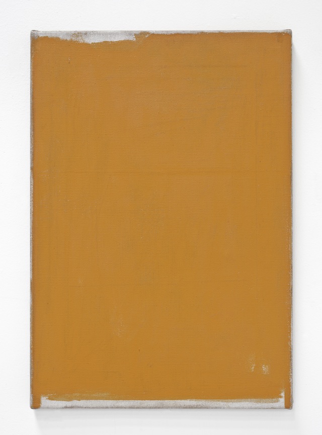
And Lighthouse… You title it Lighthouse and all of a sudden it’s easy to see it as a representation of a lighthouse, of a color. Some of the lighthouses in Iceland are painted that orange. But I just like the idea of a “lighthouse.” Just the word itself. The house does exactly what it does: it emits light. And that painting emits light. It’s very, very opaque. The way it’s so solid and it emits light… it just felt right.
JZ: What I love is that you think about this the way I do. I’m like, “Oh, I like this so I’m going to look up this and I found out this,” and then all of a sudden these meanings start to develop. I love the idea that you can have a painting in a show that will illuminate all the other paintings. So that if you just had a series of paintings and you add one painting to it all of a sudden it makes us look at all the other paintings differently.
John Zurier / MATRIX 255 runs through December 21, 2014 at the Berkeley Art Museum. For more information visit bampfa.berkeley.edu.
Thursday, October 30, 2014
Monday, October 27, 2014
Tuesday, October 14, 2014
Wednesday, October 8, 2014
When it Pours in the New Yorker
Check out this article in the New Yorker on the work of Helen Frankenthaler and Morris Louis:
WHEN IT POURS
The work of Helen Frankenthaler and Morris Louis
WHEN IT POURS
The work of Helen Frankenthaler and Morris Louis
Wednesday, April 23, 2014
Jim Hodges

|
||||||
|

![Installation shot showing "Toward Great Becoming (blue/blue)" and "Toward Great Becoming (orange/pink)", both 2014, by Jim Hodges [photo: Keith Petersen]](https://blogger.googleusercontent.com/img/proxy/AVvXsEiA0U5B_TjyEH98CMi3vg16fnwWrPdSGAbUqeGPLg6oodK3_6nO6S0VmHw7imbW3tsRsK40ggbZEO8b0ZaHsx849HlFkkjZZlMCqujExUFpgx8y9_dN26t_Qu9myaOYPq9FzJJrmdeRduin0PHpDniWumzW5b-238JkOD-xQGtcxnNlAWCqB0bUBrqZ8MqY7FbKWI3uDOg2sRs8SzVGpbdzJlMEnQUKwf49u-hp=s0-d-e1-ft)
Thursday, April 3, 2014
Abstract Exhibits in SF
Some viewing suggestions from Manuel + a query:
today went to modernism and saw:
and at toomey-tourell:
very different shows although both abstract
***************&***********
I have this artist that I am interested in but can't figure his work out Bernard Piffaretti who paints this:
Wednesday, March 26, 2014
Saturday, March 22, 2014
‘Jasper Johns: Regrets,’ a New Series at MoMA
Review of 'Jasper Johns: Regrets,' a New Series at MoMa
check out the slide show.
‘Jasper Johns: Regrets,’ a New Series at MoMA
check out the slide show.
A Lens Catches; a Painter Converts
‘Jasper Johns: Regrets,’ a New Series at MoMA
What
do you do if you’re a busy museum, and an eminent and famously
enigmatic artist in late career tells you he’s prepared to go public
with new work? You shake up your schedule, clear out some space and move
the stuff in, pronto.
That’s more or less what the Museum of Modern Art did for its straight-from-the studio show called “Jasper Johns: Regrets.” Haste can make waste. It can also make magic. And magic, of a peculiarly somber, meditative kind, is what we have here.
A
little over a year and a half ago, Mr. Johns, 83, was looking through a
Christie’s London sales catalog of work by the British artist Francis Bacon and came across photographs of the painter Lucian Freud.
They had been taken in 1964 by the photographer John Deakin at the
request of Bacon, who was planning to do a portrait of Freud but didn’t
like working with live models. (Bacon’s triptych “Three Studies of Lucian Freud” sold for $142 million last year.)
One
photo in particular caught Mr. Johns’s eye. In it, Freud is sitting on a
quilt-covered brass bed in the corner of a room with soiled walls. He
has one leg folded under the other; his head is bowed, his face obscured
by a raised hand. His stoop-shouldered, folded-in pose suggests
exhaustion, despair. He could be weeping.
The
sense of abjection was compounded by the distressed condition of the
photographic print, found in Bacon’s cluttered studio after his death in
1992. It had seen hard use. It had been creased and stained with paint;
a large, roughly rectangular section of its lower left corner had been
torn and folded back, and secured with a paper clip. (The original
print, on loan from the Bacon estate, is in the MoMA show.)
It
is on this photograph — not just the image of Freud, but the beat-up
print itself — that Mr. Johns has based a cohesive group of nearly two
dozen painting, drawings and prints. The precise appeal the picture held
for him is hard to pin down. But then, the impulses behind much of his
work have been complicated and elusive: a childhood memory, a dream, a
detail from an old master painting, or from his own work. His choices of
subjects have felt both arbitrary and deliberate, prosaic and loaded,
like Duchamp ready-mades.
More
important than the images he chooses, though, is what he does with
them, the formal and conceptual changes he puts them through. And to the
“Regrets” series he has brought a full arsenal of transforming
maneuvers used in the past.
As
always, in developing a series, he juggles several media, including oil
paint, acrylic, watercolor, charcoal, graphite, colored pencil, ink on
paper, ink on plastic, printing ink and photocopying. And his idea of
doing variations on a theme is close to dissection: cutting an image
open, picking apart its essence, moving bits around, throwing some out,
squeezing others into new shapes, in the end restoring wholeness, but
not in its initial form.
The
show — organized by the MoMA curators Christophe Cherix and Ann Temkin,
with Ingrid Langston, a curatorial assistant — is a record of such a
process, and its value, as such, is far greater than that of any single
work in it, painting or otherwise.
One
of the earliest pieces is a small, unemphatic pencil sketch of the
Bacon print, with Freud’s figure simplified, and the missing lower
corner rendered as a solid dark shape. Three words written in ink below
the drawing — “Goya? Bats? Dreams?” — suggest at least one feature that
drew Mr. Johns to the picture, an association with art history. Freud’s
face-hiding pose somewhat resembles that of the artist who sits dozing
away, swarmed by owls and bats, in “The Sleep of Reason Produces Monsters,” the renowned etching by Francisco Goya, an artist Mr. Johns has long admired.
With
a second early piece, “Study for Regrets,” an intense manipulation of
material begins. Here, Freud’s figure has been doubled into facing
mirror images, with the one on the right painted as a kind of jigsaw
puzzle of colored fragments. And new elements have been added: the word
“Regrets” and a scribbled signature, both looking handwritten, but, in
reality, produced with an inked stamp that Mr. Johns designed to reply
to social invitations.
At
this point, we’re on familiar Johns turf, defined by a mix of high and
low, serious and humorous, its essence distilled in a gloomster Freud
decked out in harlequin colors. But the tone soon shifts, darkens. In
other drawings, Freud’s figures recede in prominence, and, again in
mirror reflection, the dark shapes representing the torn section of the
print merge into a Rorschach-like whole, a large rectangle that sits at
the center of the composition.
A
shape that was once an indicator of emptiness is now, suddenly, a
monument, somewhat architectural, with its two pronglike turrets, but
also, increasingly, funereal. As the series grows, moving from drawings
into paintings, and then into prints, Freud’s figures become mere
tangles of line, and from those tangles another image emerges: a human
skull with big, empty eyes. It rests on top of the dark rectangle, which
now might be read as the door of a tomb, opened onto blackness,
oblivion.
Skulls
have turned up in Mr. Johns’s work since the early 1960s. Some scholars
say they’ve been inspired by the skulls that frequently appear in the
still lifes of one his favorite artists, Cézanne. Another explanation
may simply be that Mr. Johns is one of the few contemporary artists who
has persisted, over a long career, in taking mortality seriously as a
subject. And he has become more forthright in concentrating on it, and
personalizing it, over time.
In
this regard, his art can feel almost Victorian, a sensibility America
still doesn’t understand, which may explain arguments that Mr. Johns’s
work is obscurant and repressed. When I think “Victorian,” I think
Melville and Dickinson: passionate, sardonic moral thinkers, too in love
with beauty to be morbid. I see Mr. Johns in that light. Much of
“Regrets” is really beautiful, with half-hidden rainbow colors, tonal
subtleties and a mesmerizing diversity of line.
Because
of the title of the series, and the fact that an octogenarian produced
it, there’s a tendency to view the show as a valedictory gesture, the
end of something. But it doesn’t feel that way at all. It feels assured
and centered, quiet but with lots of give, sagely alive.
“Jasper Johns: Regrets” continues through Sept. 1 at the Museum of Modern Art; 212-708-9400, moma.org.
Friday, March 21, 2014
ABOVE AND BELOW THE SURFACE at JOHN BERGGRUEN GALLERY
If you can, please try to see this show: ABOVE AND BELOW THE SURFACE at
john berggruen gallery
John Berggruen Gallery
228 Grant Avenue
San Francisco, CA 94108
Hours:
Monday through Friday:
9:30am - 5:30pm
Saturday:
10:30am - 5:00pm
Contact
228 Grant Avenue
San Francisco, CA 94108
Hours:
Monday through Friday:
9:30am - 5:30pm
Saturday:
10:30am - 5:00pm
 |
|
Suzanne McClelland Ed Corney (Ideal Proportions), 2013 Dry pigment, gesso, polymer and oil paint on portrait linen 84 x 72 inches |
Monday, March 17, 2014
Joshua Aster's work and influences
I visited Josh's studio before his show at Edward Cella and got to see a lot of the influences that went into these paintings. a major influence was the generic green basked that fruit comes in at the supermarket. He drew these from different angles and the triangles you see in the large paintings are distortions of the grid.
Joshua Aster at Edward Cella

Joshua Aster at Edward Cella
 |
| Joshua Aster, Wistful Thinking, 2014 Oil on linen, 78 x 82 in |
 |
| Joshua Aster, Panes, 2013 Oil on linen, 72 x 60 in. |

Friday, March 14, 2014
EMILIA AZCARATE 'LIMINAL'

Henrique Faria Fine Art
35 East 67th Street, fourth floor,
Manhattan
Through March 22
Developments
in Emilia Azcárate’s art appear to reflect changes in her spiritual
life. Born in Venezuela in 1964, now living in Spain, Ms. Azcárate was
raised Roman Catholic, joined the Krishna consciousness movement in her
20s, and more recently became a devotee of Nichiren Buddhism. All three
disciplines are ritual-intensive, and so, in different ways, is the work
in Ms. Azcárate’s first New York solo.
The
circular shape, in essence an interfaith form, predominates. One
example fills a wall: Its radiating and concentric lines are composed of
metal bottle caps the artist has collected in her travels, each
flattened and cut into spiky florets representing Hindu and Buddhist
chakras or wheels. A few small pictures on paper have designs worked out
from strings of alphabetical letters typed on an old typewriter.
A
group of dozens of watercolor paintings on wood panels seems, with the
works’ bright colors and busy patterns, designed far less to focus the
eye or mind than to keep both on the move. And the grouping itself is
kinetic. The different-size panels are ganged together upright and
free-standing on a shelf, and visitors are invited to rearrange them as
they please.
Piece
by piece, there’s nothing formally new about Ms. Azcárate’s art, but
the potential for hands-on interaction is appealing, as is the
ritualistic ongoingness of her project. During the course of the show,
new mandalas arrive at the gallery each week, painted and typed on
postcards sent from her studio in Madrid, or from wherever she may be.
Monday, March 3, 2014
MATERIAL CHOICES
Material matters in the work of Ulrike Muller
Muller uses baked enamel on steel to create small compressed abstractions using a geometric abstractions. The materiality of the cast enamel heightens the effect of these the hard-edged shapes, creating a "freshness" of seeing that ratchets up the viewing experience.

Muller uses baked enamel on steel to create small compressed abstractions using a geometric abstractions. The materiality of the cast enamel heightens the effect of these the hard-edged shapes, creating a "freshness" of seeing that ratchets up the viewing experience.
Subscribe to:
Posts (Atom)